1. BACKGROUND
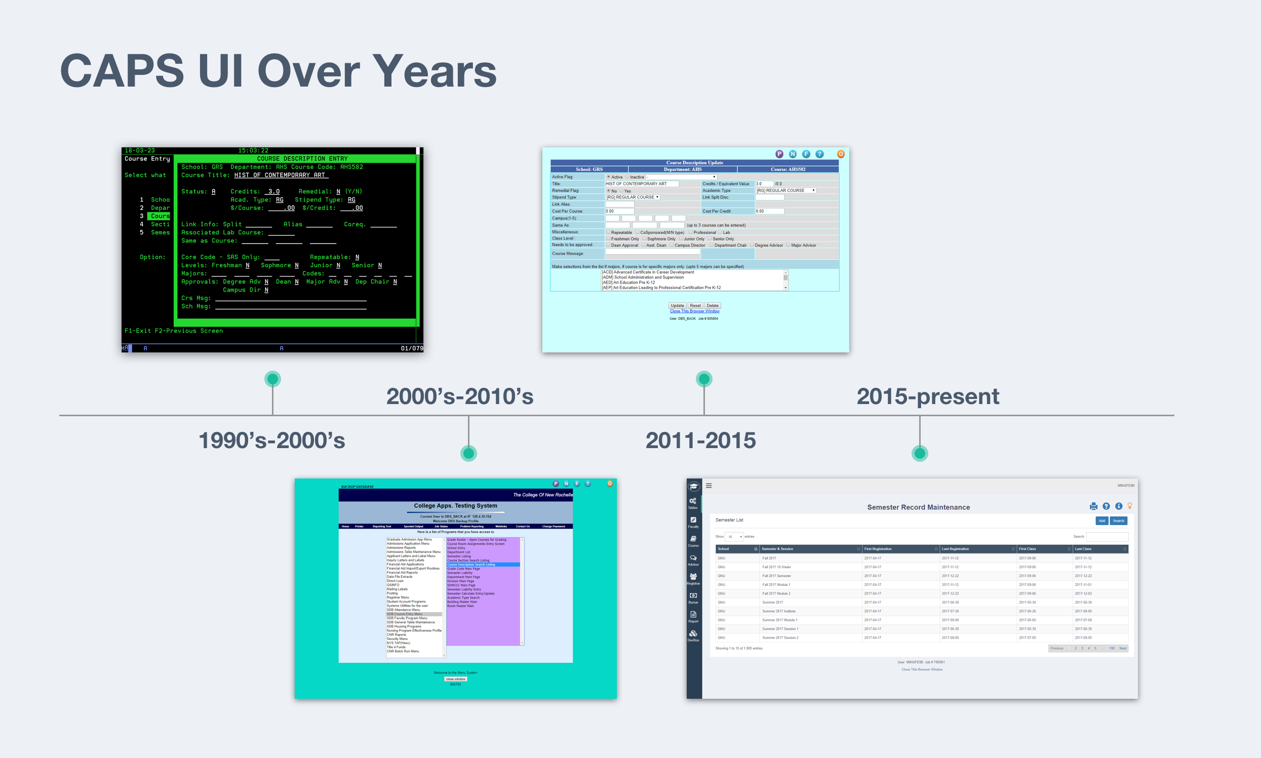
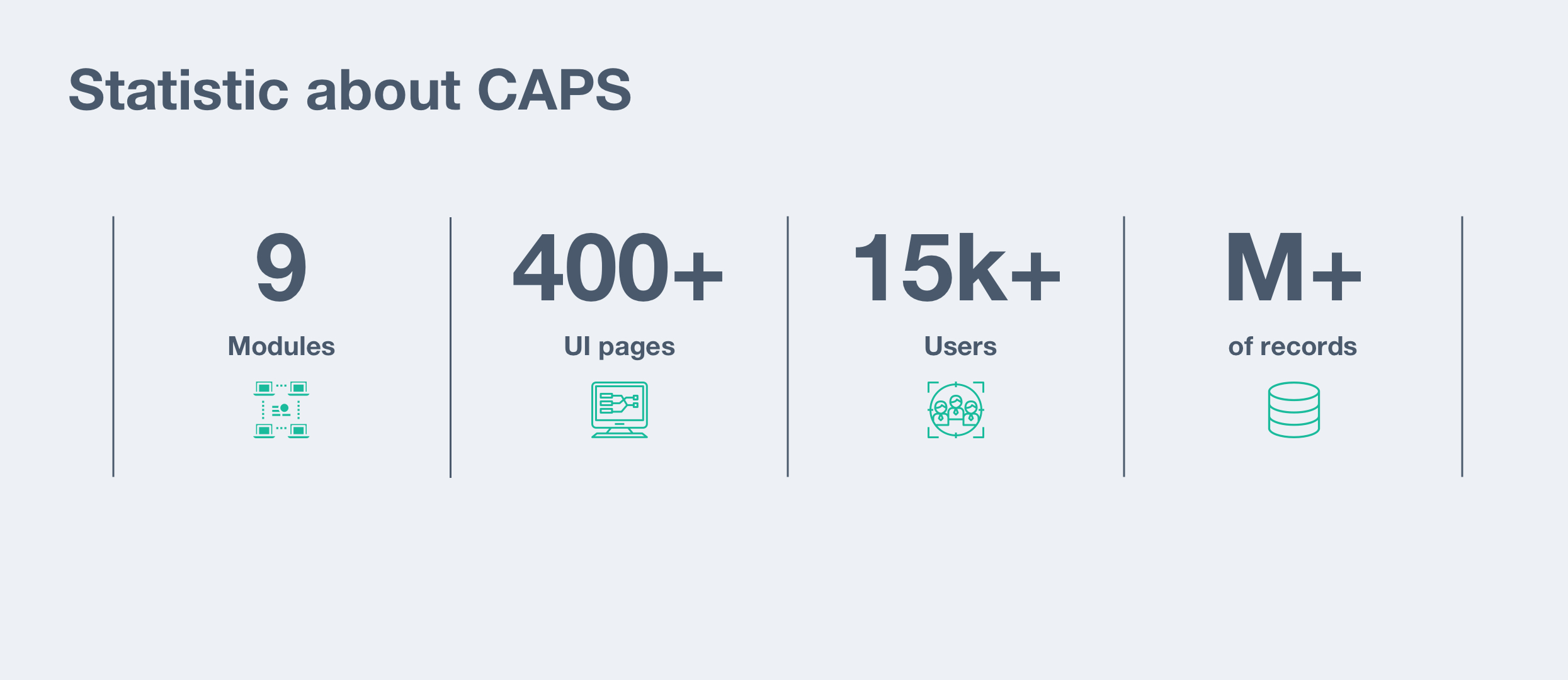
CAPS(College Administrative Process System), consisting of nine modules responsible for institutional operations, is a comprehensive system for college and university administration. As the only designer in the team, I improved the user experience of this platform from out-dated IBM green screen to the web application, also redesigned the online application user workflows with a detailed UI guide.
2.Problems
After I experienced the platform and studied the user support data, I figured out the following issues.
First,inefficient workflow slows down users working progress; for example, before the registration, employees needed to keyboard over hundreds of course sections' information into the system manually. Compared to a platform with a friendly user experience, our system demands staff spent unnecessary steps to get their jobs done.
Second, inconsistency UI caused an obstacle of communication between the system and end-users. They got confused from feature to feature, sometimes even prevent them from finishing their workflow. To accomplish their tasks, they need to contact the development team; This distracted the team because the developers end up spending much time doing user support or data entry job.
3. PLAN & EXECUTION
To solve these UX/UI problems, I made a plan. For the workflow part, I planned to facility user research. To understand the whole users' story, I can get insights and provide solutions. For the UI part, each page should use the same visual language to talk with our users. My plan was to design a UI library that delivers a consistent visual experience to users.
3.1 Workflow redesign
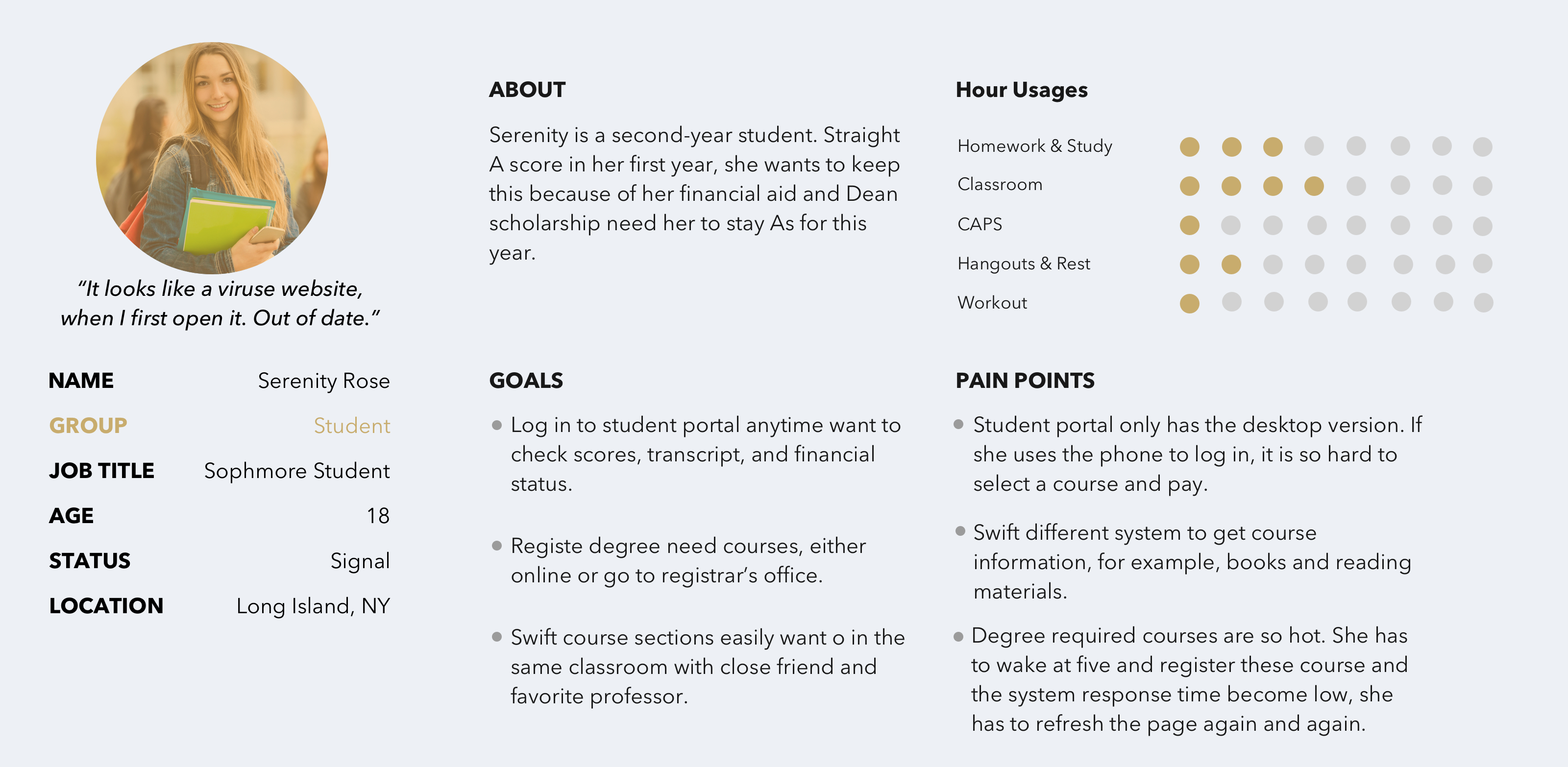
I started to schedule interviews to talk with our end-users. Initially, I spoke with 15 faculties and staff from different schools/departments and 5 students as well. My topics were not limited by how they used the system but also other frustrations they meet in their campus life. What was the primary task during their daily routine, and how to achieve the goal? Comparing other tasks, why this one wast the high priority? And etc.


Additionally, I had opportunities to obverse their work. That was a fantastic experience for me to see how they collaborate and an essential resource to design crossing department workflows.
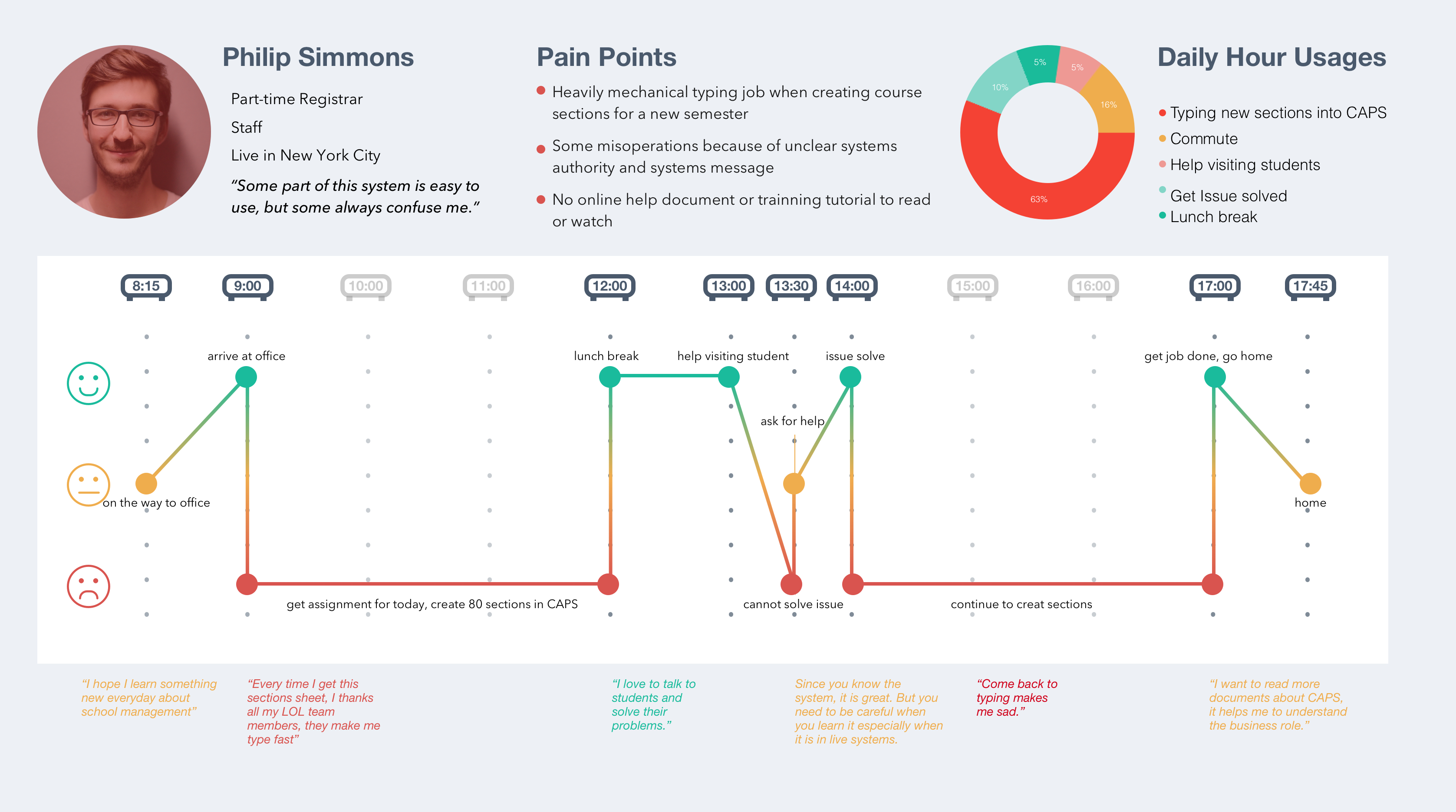
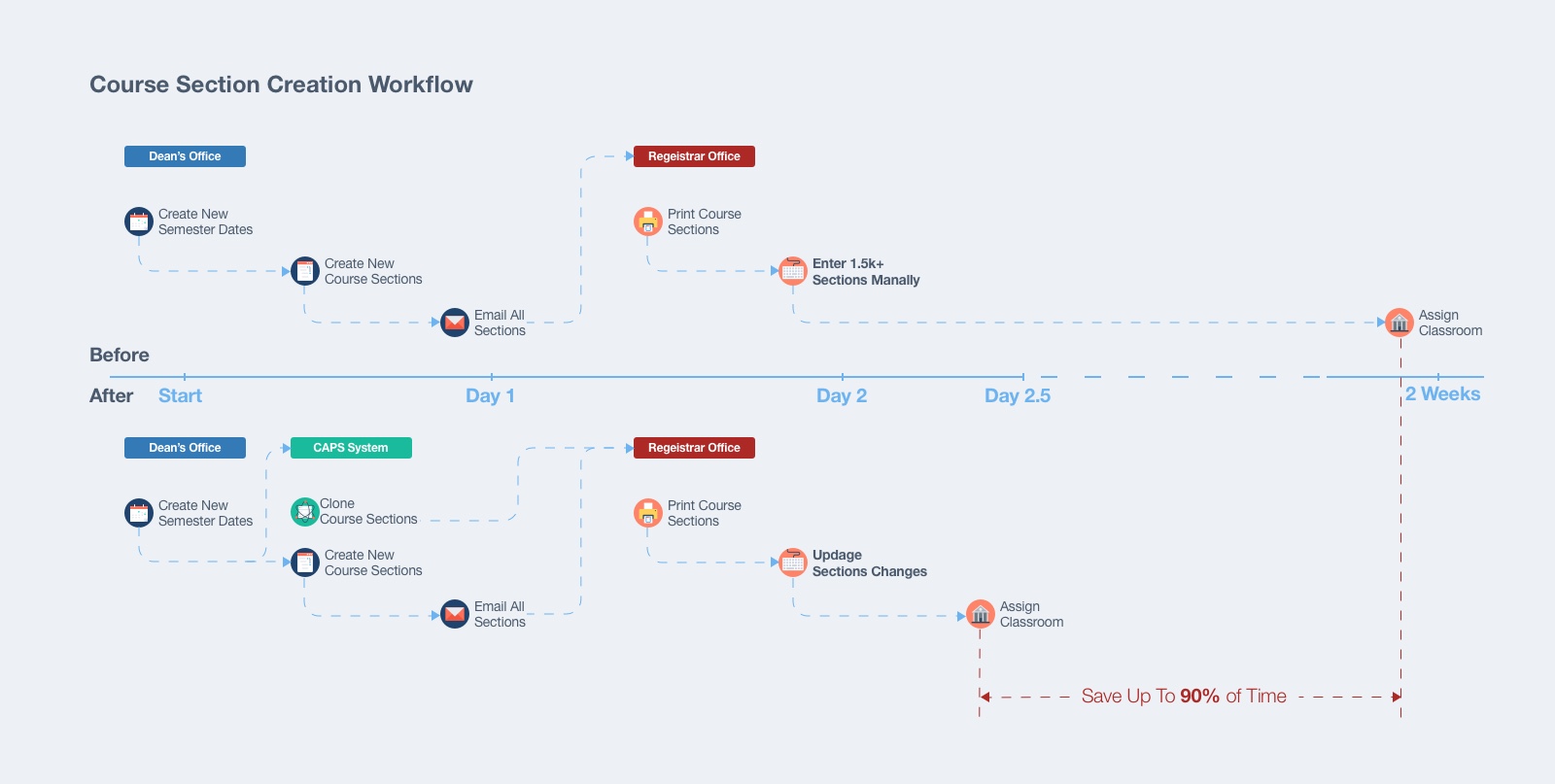
One project was for the registrar's office, which is improving the course sections' creation process. Before the registration date, the registrar's office receives around one thousand and five hundred course sections' records form dean offices. They printed out and entered these data manually for almost two weeks.
My first thought was uploading these course section excel file to our system. However, the data format and content of all these excel files is different form each dean office. It was a considerable time and effort investment for our development team to code a flexible program to read these variables.
My next idea was like an Arabian night's story. The system created these course sections by itself. The reason is apparent, it was the most convenient way for the registrar's office to get all the information into the system. But how? I believed the answer was from the dean office but the registrar's office. I heard the whole story when I visited the dean's office. After the president's office announced, a new semester's begin and end dates. The dean's assistant will check all the sections changes for the new semester, like credits, but occurred less than 5% of the total number, and then copied and pasted to a new excel file and then updated changes. Finally, they sent to registrars' office via email.
After testing, both the dean's office and registrar's office were happy with the results. It saved them up to 90% of the time.
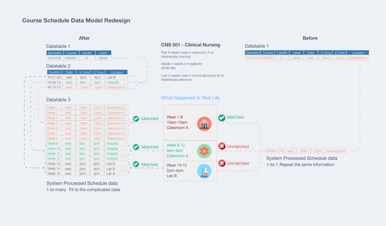
Sometimes I need to dig far more than I had thought. The source of users' pain points was the head of an iceberg. We got students' complain about the inaccuracy of the course schedule information published online. For example, some of the spring/fall semester courses are short-term classes, only happened in the first half of the semester. However, when the students want to register another short class in the second half-semester, they had to use multi-pages and draw a calendar to check the time conflict by themself.

I studied our database structure, and came to the development team, discussed the redesign. Our current course section data table contains the schedule information. This design fixed one to one relationship between course and its schedule, which means a course section can only be associated with one day of the week, banding thought the semester.
Our redesign was changing the one-to-one data model to one-to-many, divided the original one huge data table into three small ones. One of the three data tables only had section's academic information, like course level, credits, and cloned from the previous semester. The second table maintained the schedule information, like start and end date, and skip week record. The schedule information was added by the registrar's office. And the last one had each single class day/time and location information. These pieces of information are created by the back-end program based on one row in table two.
The testing results showed the issue solved nicely under this solution. And under this data structure, we had a flexible infrastructure to design more features like classroom time conflict checking, student/faculty class calendar posted on their portal homepage. Framing the problem and finding the right team to work with was the key to solve this problem.
3.2 UI Redesign
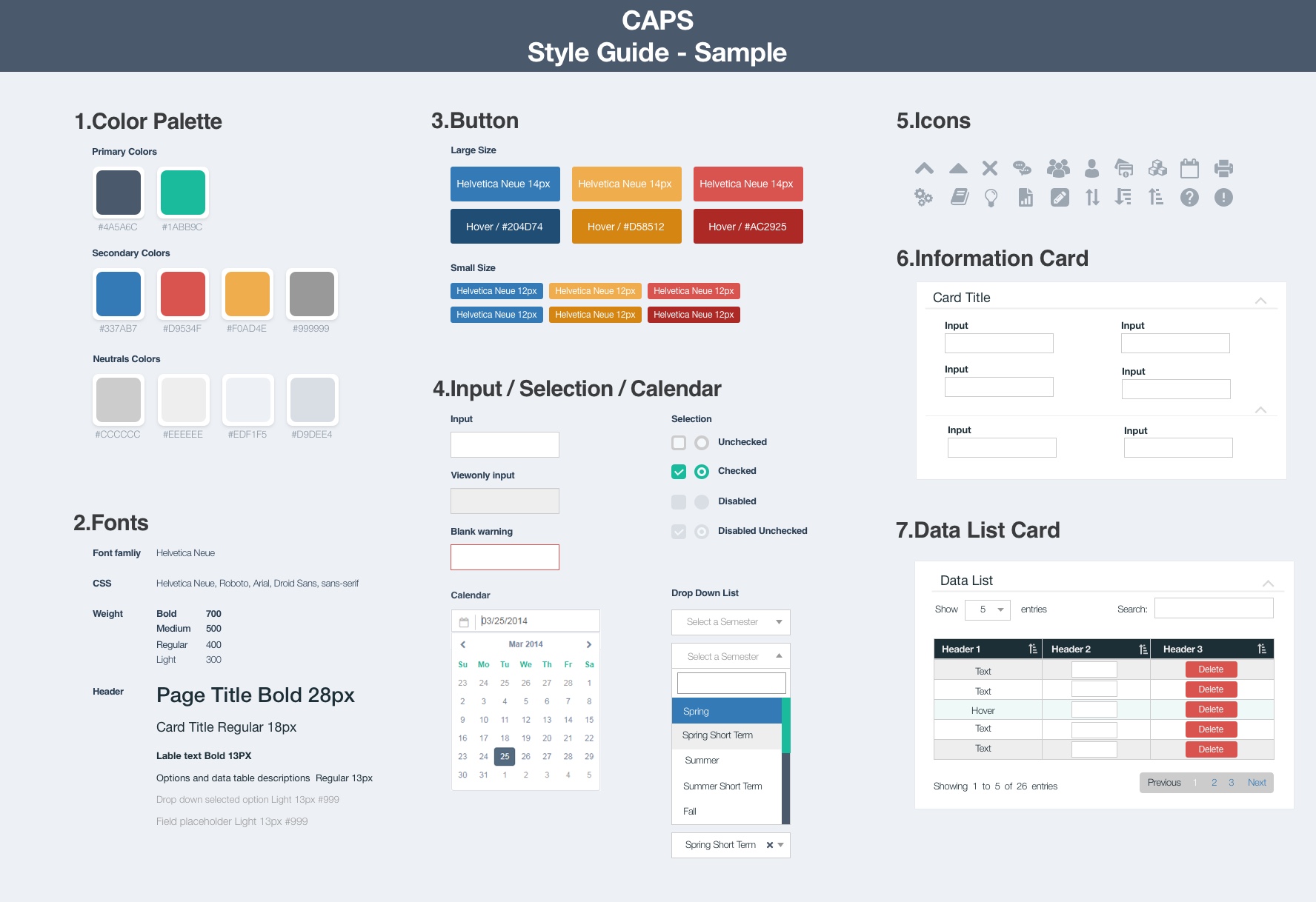
More contacts with the clients, more understanding which part of the UI didn't work for them. It was time to design the UI library.
I gathered the most visited pages on our systems and cut these pages into essential design pieces, field, and dropdown. After all these small pieces redesigned, I put them back to a design pattern with versions, like the data table. I refreshed the design of these pages with one final version. At last, I document these into one UI library.

Additionally, I code HTML/CSS templates based on the UI library. All the developers coded the same visual and layout thought all the user interfaces.
I bought the new UI shows to our client, but I recognized one-size screen design cannot fit all users' needs. Registrars use office desktops to review course information; professors use tablets to check students' attendance, and students use their cell phones to pay tuition. Considering these scenarios, I introduce responsive design to the team. Since we implemented the CAPS UI library and open source JS libraries, we spend less effort while achieving more effects. This was an excellent opportunity to iterate the UI library. After eight weeks of design, testing, and development, CAPS became a responsive system.
4.Takeaway
Framing the right problems is a critical step to design. As a designer, learning to communicate with users is a fundamental way to frame the problems. Fitting into the team, listening, contributing, taking ownership, and collaborating smart are the elements to make a project/product success.